
As a Shopify expert, I often work with merchants seeking a faster way to launch seasonal campaigns, new collections, and storefront updates without turning every release into a late-night fire drill. Maestro Theme Scheduler solves the timing problem, but accessibility still belongs to your QA process.
That distinction matters. Maestro is a scheduling and deployment tool. It does not automatically guarantee WCAG compliance, validate every custom component, or spot a keyboard trap hiding inside a custom Shopify theme. Used properly, however, it gives Shopify Plus development teams a reliable way to coordinate tested storefront changes.
This is the finale of our 100-post Maestro Theme Scheduler roadmap, so let’s end with the check that should accompany every scheduled release: making sure the storefront remains usable for as many customers as possible.
Why accessibility QA belongs in your scheduling workflow
A theme change can look harmless in the editor and still create real barriers after publication. A new promotional banner may introduce low contrast. A redesigned menu may lose keyboard support. A scheduled product section may display a decorative image with a confusing alt attribute.
An accessibility-focused release process helps you:
- Protect the shopping journey across desktop, tablet, and mobile.
- Reduce regressions in custom Shopify themes and app-powered components.
- Improve usability for keyboard users, screen reader users, and customers with low vision.
- Create a safer deployment rhythm for campaigns, product launches, and seasonal events.
- Give your team a practical rollback plan before the promotion starts.
Use Shopify’s theme accessibility guidance as a foundation, then add manual testing to cover the things automated scanners cannot understand.
Choose the right scheduling level
Maestro Theme Scheduler supports a useful distinction between a focused content change and a complete theme publication.
Use granular section or block scheduling for lower-risk updates
Schedule a specific section or block when the change is limited, such as:
- A campaign headline or announcement bar.
- A promotional image and its supporting copy.
- A featured collection block.
- A seasonal call-to-action.
- A temporary content setting or product highlight.
This approach can reduce the release surface area, but it does not remove the need for testing. A single block can still affect heading structure, color contrast, focus order, responsive layout, or screen reader announcements.
Before scheduling, compare the changed section with the live version and test it in context. A block that works beautifully on the homepage may behave differently inside a collection template or a custom landing page.
Use full theme publishing for larger structural changes
A full theme publish may include changes to:
-
theme.liquidand global layout files. - Header, navigation, footer, and cart components.
- Product, collection, search, and page templates.
- CSS variables, typography, and color tokens.
- JavaScript for drawers, modals, filters, galleries, and carousels.
- App embeds and third-party widgets.
Treat a full theme publish as a proper release, not a larger version of “change the banner.” Duplicate the theme, complete the accessibility checks below, document the result, and keep a previously validated theme available for rollback.
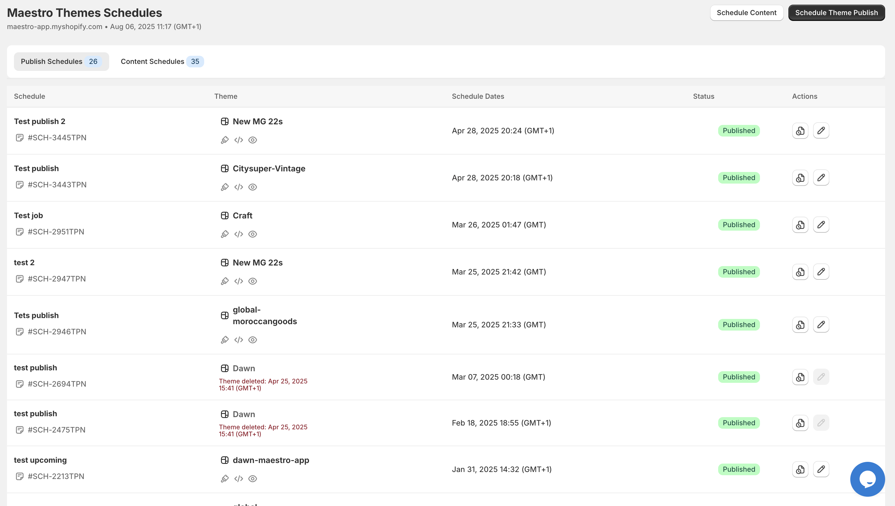
Annotated screenshot guidance: Add callouts to the dashboard’s Schedule, Theme, Schedule Dates, Status, and Actions columns. Use the annotation to explain that accessibility QA status can be tracked alongside the release record, even if the final pass is managed in your team’s QA system.
A step-by-step accessibility QA process
Step 1: Record the release scope
Start by listing exactly what will change.
Include:
- Templates, sections, blocks, snippets, and assets.
- New or edited headings and copy.
- Color, font, spacing, and layout changes.
- Interactive components, including menus, modals, filters, and galleries.
- App blocks, app embeds, and scripts that may render on affected pages.
- The intended publish date, time zone, and campaign window.
In Maestro, use a clear schedule name such as “Holiday Collection Launch, Accessibility QA Approved”. Add a note with the ticket number, tested theme name, QA owner, and rollback theme. Good release notes are not glamorous, but neither is searching through six nearly identical themes at midnight.
Step 2: Check headings and landmarks
Inspect the homepage, collection page, product page, cart, search results, and any custom landing pages affected by the change.
Confirm that:
- Each page has a logical heading hierarchy.
- The primary page purpose has one clear H1 where appropriate.
- H2 and H3 elements describe sections rather than merely styling text.
- Main regions use meaningful landmarks such as
header,nav,main, andfooter. - A skip to main content link is present and works.
- The visual order matches the reading order in the HTML.
Pay particular attention to scheduled promotional blocks. A block setting called “Heading” should render as a real heading, not a styled div. If a section is decorative, do not give it a heading simply because the editor makes one available.
Step 3: Validate color contrast and visual states
Check every changed foreground and background combination, including text over images.
As a practical WCAG 2.2 AA target:
- Normal text should reach at least 4.5:1 contrast.
- Large text should reach at least 3:1 contrast.
- Important non-text controls and focus indicators should reach at least 3:1 contrast.
Test more than the default state. Check:
- Hover.
- Focus.
- Active.
- Disabled.
- Error and success states.
- Text placed over promotional imagery.
- Icons, borders, quantity controls, and form fields.
Use a tool such as WebAIM’s contrast checker, then confirm the result in the actual theme. A color token can pass in isolation and fail when placed over an image, gradient, or transparent overlay.
Step 4: Navigate the storefront with a keyboard
Put the mouse aside and use:
TabShift + TabEnterSpace- Arrow keys
Escape
Test the complete path from homepage to checkout. Confirm that customers can:
- Open and close the main menu.
- Search for a product.
- Use collection filters.
- Select product variants.
- Add an item to cart.
- Update quantity.
- Open and close the cart drawer.
- Move through checkout controls.
Look for keyboard traps, skipped controls, unexpected focus jumps, and controls that only respond to a mouse click. Menus and drawers should expose their state, support Escape where appropriate, and return focus to a sensible trigger when closed.
Step 5: Make focus visible
Never remove the browser focus outline without replacing it with something better.
Check that focus is visible on:
- Links and buttons.
- Icon-only controls.
- Search fields.
- Variant selectors.
- Quantity steppers.
- Filter controls.
- Modal close buttons.
- Cart drawer actions.
- App-injected widgets.
A clear :focus-visible style can help, but test it against every background and responsive layout. A focus ring that disappears on a dark campaign banner is not doing much heavy lifting.
Step 6: Review alt text and accessible names
For every changed image, ask what purpose it serves.
- Meaningful product or campaign images: Add concise alt text that communicates the relevant information.
- Decorative graphics: Use an empty alt attribute so screen readers can skip them.
- Icon-only links and buttons: Provide an accessible name, such as “Open search” or “View cart.”
- Product galleries: Announce image changes and ensure thumbnails are keyboard accessible.
- Status icons: Do not communicate sale, error, or availability through color or imagery alone.
If a scheduled section swaps an image at campaign start, verify both the before and after versions. Alt text is content, not a final polish item.
Step 7: Test motion and dynamic announcements
Scheduled campaigns often bring carousels, countdowns, animated banners, and popups along for the ride. Test them with reduced motion enabled.
Confirm that:
- Moving content can be paused, stopped, or hidden when necessary.
- Animations do not create distracting or rapid flashing.
- The theme respects the user’s reduced-motion preference.
- Carousels do not move focus unexpectedly.
- Content revealed on hover is also available on focus.
- Tooltips and popovers can be dismissed with a keyboard.
- Cart updates are announced through a suitable status or live region.
- Variant changes communicate price and availability updates.
- Filtered result counts are announced after the product grid refreshes.
Maestro can schedule the change. Your theme code still needs to communicate what changed.

Annotated screenshot guidance: Highlight the content scheduling, grouped schedules, and Shopify Flow areas. Explain that teams can coordinate a theme release with operational notifications or follow-up tasks, but should keep accessibility verification as an explicit human QA step.
Step 8: Test responsive behavior and zoom
Check the scheduled storefront at common desktop, tablet, and mobile widths. Then increase browser zoom to 200%.
Look for:
- Clipped text or overlapping controls.
- Horizontal scrolling across the entire page.
- Buttons that become unreachable.
- Sticky bars covering focused content.
- Mobile drawers that do not trap or restore focus correctly.
- Touch controls that are too small or too close together.
- Promotional text that disappears over a responsive image crop.
Custom Shopify themes often contain breakpoint-specific logic, so do not assume that a desktop pass covers mobile. Test the actual campaign layout at the actual breakpoint where it will appear.
Schedule responsibly with Maestro
Once the QA pass is complete:
- Select the validated theme or section.
- Choose the correct date, time, and time zone.
- Name the schedule clearly.
- Add a release note with QA evidence and rollback details.
- Review recurring settings carefully so a temporary campaign does not quietly become permanent.
- Confirm the schedule in the dashboard.
- Assign an owner for post-publish monitoring.
For larger Shopify Plus development teams, connect the release to your existing ticketing, monitoring, and Shopify Flow processes where appropriate. Cross-app tools such as Product Maestro Scheduler may help coordinate product timing, but keep the theme accessibility review attached to the storefront release itself.
Plan the rollback before publishing
Define rollback criteria before the scheduled time. Roll back immediately if customers cannot:
- Navigate the main store with a keyboard.
- See focus on critical controls.
- Read primary text or use key controls due to contrast failures.
- Understand product options, cart changes, or form errors.
- Complete the purchase journey.
Keep one previously validated theme copy available. Record its name, version, and last QA date. After publishing, run a fast smoke test across the homepage, collection, product, cart, and checkout flows. If a release goes live during a major campaign, monitor customer support tickets, conversion signals, and error reporting closely.
Concise accessibility checklist
Before scheduling a Shopify theme change, confirm:
- Scope includes templates, sections, blocks, app embeds, and assets.
- Headings and landmarks remain logical.
- Text, icons, controls, and focus states meet contrast targets.
- Keyboard navigation works without traps.
- Focus remains visible and predictable.
- Images have appropriate alt text.
- Motion respects reduced-motion preferences.
- Dynamic updates are announced.
- Layout works at mobile widths and 200% zoom.
- A validated rollback theme is ready.
- Post-publish smoke testing has an owner.
Internal-link suggestions for the Maestro series
For this finale, link readers to:
- Maestro Theme Scheduler for the product overview.
- Shopify integrations when discussing connected workflows.
- Shopify speed optimization when discussing performance alongside accessibility.
- Shopify design services for custom Shopify themes and UX improvements.
- Migration to Shopify for teams planning a platform transition.
- Book a meeting with XCO Agency for implementation support.
Final thoughts
Scheduling a storefront change is powerful, but responsible scheduling means more than selecting a date and clicking publish. Use granular section and block scheduling to reduce unnecessary scope. Treat full theme publishing as a complete release. Test the experience with a keyboard, a screen reader, zoom, reduced motion, and real responsive layouts.
Maestro Theme Scheduler helps your team publish at the right moment. A disciplined accessibility QA workflow makes sure the experience is still right for the people arriving at that moment.
That makes accessibility testing a vital step before scheduling and a proactive step after publication. Ready to build a safer, faster release process for your custom Shopify theme? Contact XCO Agency for expert Shopify Plus development, theme optimization, and ongoing support.
SEO meta title: Advanced Accessibility Checks for Shopify Theme Changes | Maestro
SEO meta description: Learn how to use Maestro Theme Scheduler responsibly with custom Shopify themes. Follow practical accessibility checks for headings, contrast, keyboard navigation, motion, alt text, responsive behavior, and rollback planning.